Tony Hawk’s Pro Skater Showed How Games Can Capture a Generation
Tony Hawk's Pro Skater captured a time, place, and people in ways that few others games ever have.

September 2024 marks the 25th anniversary of Tony Hawk’s Pro Skater: the seminal sports game that elevated skateboarding worldwide, made Tony Hawk a household name, and launched a robust sub-genre of extreme sports games that lasted for over a decade. While the game series’ publisher Activision would reteam for other skating games, none had the success or enduring cultural relevance as Pro Skater and its immediate sequels. More than just contemporary success, Tony Hawk’s Pro Skater evokes a specific era in American pop culture, one that gamers can revisit for a nostalgia boost or younger players can experience to glimpse into like a digitized time capsule.
With so many games taking place within the genres of fantasy or science fiction, it’s hard to get a popular title that reflects the cultural zeitgeist clearly. Tony Hawk’s skating games always worked best when they leaned into contemporary trends while keeping their feet – or, more accurately, skateboard – on the ground. Set to a propulsive, punk rock-friendly soundtrack that created as much atmosphere as its slickly designed levels and real-life skaters, Pro Skater embodied a generation looking for the reckless abandon and daredevil antics skateboarding games provided. Without the bumps and bruises from actually skating themselves, of course.
The Icon Behind A Gaming Phenomenon
After the successful launch of Sega’s arcade game Top Skater in 1997, Activision decided to develop its own skateboarding game to expand its line and appeal to a wider gamer base. Neversoft, who were primarily known for developing action games, was given the assignment, with the team consciously moving away from the linear levels in Top Skater and favoring the fun factor over realism when developing the level design and gameplay physics. But just as the Madden series had John Madden and Punch-Out had Mike Tyson (at least, initially), the planned skating game needed its own recognizable figurehead to help promote the game and lend a greater sense of legitimacy.
Hawk was interested in more than just lending his name and likeness to Activision; he wanted to play a more direct role in ensuring the game got the spirit of skateboarding right and introduced the sport to a wider audience. With that in mind, Hawk also agreed to serve as a creative consultant on the game, testing numerous early builds of the game and secretly sharing them with other skaters that he personally trusted to get their feedback and build early buzz in the skating scene. More than just lending insight and advice on the mechanics and environment of the skateboarding scene, Hawk also wanted the game to reflect the wider culture around the sport, particularly the type of music listened to by many skaters he was familiar with.
The Music of Tony Hawk’s Pro Skater
Every Tony Hawk game, starting with the original, had a carefully curated soundtrack of both classic songs and contemporary tunes, usually oriented towards punk rock. The first Pro Skater only featured ten songs in its soundtrack with a decidedly more punk and thrash orientation compared to its sequel. Punk stalwarts like The Vandals, Dead Kennedys, and Goldfinger are among the standouts. The Pro Skater sequels would not only expand upon the number of tracks available in their soundtracks but also feature a broader variety of genres while retaining its punk rock roots.
By 2000’s Tony Hawk’s Pro Skater 2, the soundtrack expanded to include nu-metal acts like Papa Roach, hip-hop groups like Naughty by Nature, and hard rock bands including Rage Against the Machine and Powerman 5000. The Pro Skater soundtracks immediately became a firm part of the games’ identity, from Goldfinger’s “Superman” becoming the series’ unofficial anthem to the rousing open notes of Rage Against the Machine’s “Testify” greeting players as Pro Skater 2 booted up. Tony Hawk observed how song choices in underground skating videos and skate parks made a huge deal in how skaters and the community were perceived. This attention to detail carried over to the Pro Skater soundtracks.
The Pro Skater developers recalled that the first game’s limited budget and recognition helped them secure bands that were less interested in working with larger projects and studios. This helped lend to the series’ sense of authenticity and street cred among skateboarding communities and introduce newcomers to that underground scene. By the later sequels, Hawk recalls bigger bands approaching him to potentially secure a spot on game soundtracks, some of which Hawk declined as they didn’t match the ethos of the games and the greater skating community.
Capturing an Era
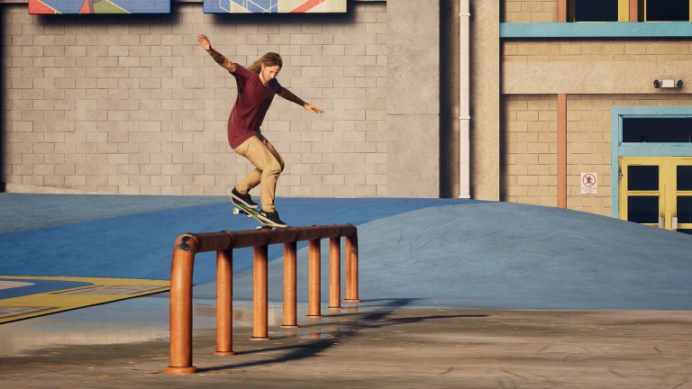
Of course, while the soundtrack is a major part of Pro Skater’s continued nostalgia factor, it’s far from the only thing that makes the game series so distinctly representative of its era. The general aesthetic of the Pro Skater games feels so uniquely late ‘90s and early 2000s and something that competing contemporary extreme sports games, and even subsequent Tony Hawk series, failed to distill in their own gameplay experiences. This nostalgia also goes beyond the technical presentation of the Pro Skater games because it remains lovingly intact on modern consoles with the acclaimed 2020 remake, Tony Hawk’s Pro Skater 1 + 2.
Joining Tony Hawk was a roster of handpicked popular skaters at the time, ranging from Kareem Campbell to Bucky Lasek, fronting brands that one could find on t-shirts everywhere at the time, like Element or Volcom. Players would track down VHS tapes to help earn points to unlock future levels while the environments they could skate in, from abandoned shopping malls to real-life locations like Venice Beach, felt evocative of the time. Even the games’ unlockable characters, like Darth Maul, Spider-Man, and Jango Fett, all reflected popular movies of the era and fit seamlessly into the main playable roster.
There is something in the spirit of Pro Skater and the skating community that connected with a generation, grounded in just enough verisimilitude to feel like the real world with a rascally spirit that didn’t speak exclusively to jocks like Madden or FIFA, but to gamers of all backgrounds and social strata. The majority of the tunes that were on each soundtrack weren’t necessarily blowing up charts on TRL while the skaters were rarely paradigms of conventional athleticism. The Pro Skater games invited everyone to jump in and play while its attention to detail and authenticity helped reinforce its contemporary qualities transitioning into early 2000s nostalgia.
The Long Decline and Revival
Unfortunately, nothing gold can stay and that certainly applies to Pro Skater, with the developers looking to reinvent the franchise after Tony Hawk’s Pro Skater 4. While Neversoft began working on what was originally planned to be Tony Hawk’s Pro Skater 5, it eventually shifted as a new series to move away from the established formula and make the franchise even more accessible to new gamers. This led to 2003’s Tony Hawk’s Underground and its 2004 sequel, which offered features like a story mode, create-a-skater, and a greater emphasis on creating general mayhem, reflecting the inclusion of skater and Jackass star Bam Margera.
Though initially successful, critical reviews were diminishingly positive with each subsequent entry while the core ethos of the Tony Hawk franchise felt increasingly diluted. After Neversoft was folded into Infinity Ward by Activision, the Tony Hawk franchise was entrusted to Robomodo, who released Tony Hawk’s Pro Skater 5 in 2015 to abysmal reviews and sales. While many things went wrong with Pro Skater 5, some of the biggest problems were its noticeable lack of polish and detail in capturing the skating scene. Past Pro Skater games felt like they were coming from a place of passion. Pro Skater 5 felt like a rushed attempt to maintain the license.
One of the biggest surprises from Activision within the past five years was the decision to remake the first two Pro Skater games in 2020 as Tony Hawk’s Pro Skater 1 + 2. Developed by Vicarious Visions, that remake recaptures that sense of passion in details and authenticity that Pro Skater 5 lacked while updating the games to reflect the skating community as it looks today. The classic roster is back, as is much of the original soundtracks, but with newer, younger skaters to reflect the current generation and newer, fresher music tracks juxtaposed right there with classics, including Goldfinger’s “Superman.”
What 1 + 2 achieves is a delicate balance between nostalgia and maintaining the core Pro Skater gameplay. Upgraded technical presentation, modern sensibilities, and quality-of-life improvements triumphantly bring Pro Skater into contemporary times. 1 + 2 works precisely because it never feels dated or of its original era so much as a true revival that earns its nostalgia boost without being completely beholden or defined by its classic elements for the sake of living in the shadow of glory days. Critics and fans took notice, and 1 + 2 went on to become the fastest-selling Tony Hawk game to date.
Despite this success, the future of the Tony Hawk gaming franchise remains as nebulous as ever, with plans for Tony Hawk’s Pro Skater 3 + 4 quietly shelved after Activision folded Vicarious Visions into Blizzard Entertainment. In their time, though, those early Tony Hawk games felt so much like the world we lived in at the turn of the millennium, right down to its baggy cargo shorts and fast-paced ska music. Before the major label bands took notice and the gimmicky lengths the franchise would go to in an effort to stay relevant and fresh, the original Pro Skater was just interested in creating a fun, accessible, and relatively authentic skateboarding gaming experience. In keeping clear sight of these goals, it produced games that have stood the test of time and helped define an entire generation of gamers.


